
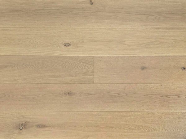
Arrange oak flooring colors into three clear groups: light tones, balanced neutrals, and warm browns. Within each group, explain the differences in undertone, grain, and overall appearance. For distributors and large retailers, this creates a display that supports comparison without presenting the colors as a sales ranking or an inventory recommendation.
FineFloor’s Amara Collection provides eight examples for this approach: Laguna, Auburn, Cordoba, Venice, Carrara, Riviera, Toscana, and Savoy. This display plan covers those eight selections; it does not define the collection’s total color count. The aim is to give each sample a clear role and help showroom teams explain why two similar-looking options may suit different design directions.
1. Give Each Color a Clear Display Role
Start with the comparison customers need to make. Are they choosing between a light natural appearance and a cream tone? Between beige with gray undertones and a balanced greige? Or between earthy brown and amber brown?
Use the following arrangement as a starting point. These groups are merchandising choices, not formal color grades.
| Display group | Color | Appearance to explain | Suggested comparison |
|---|---|---|---|
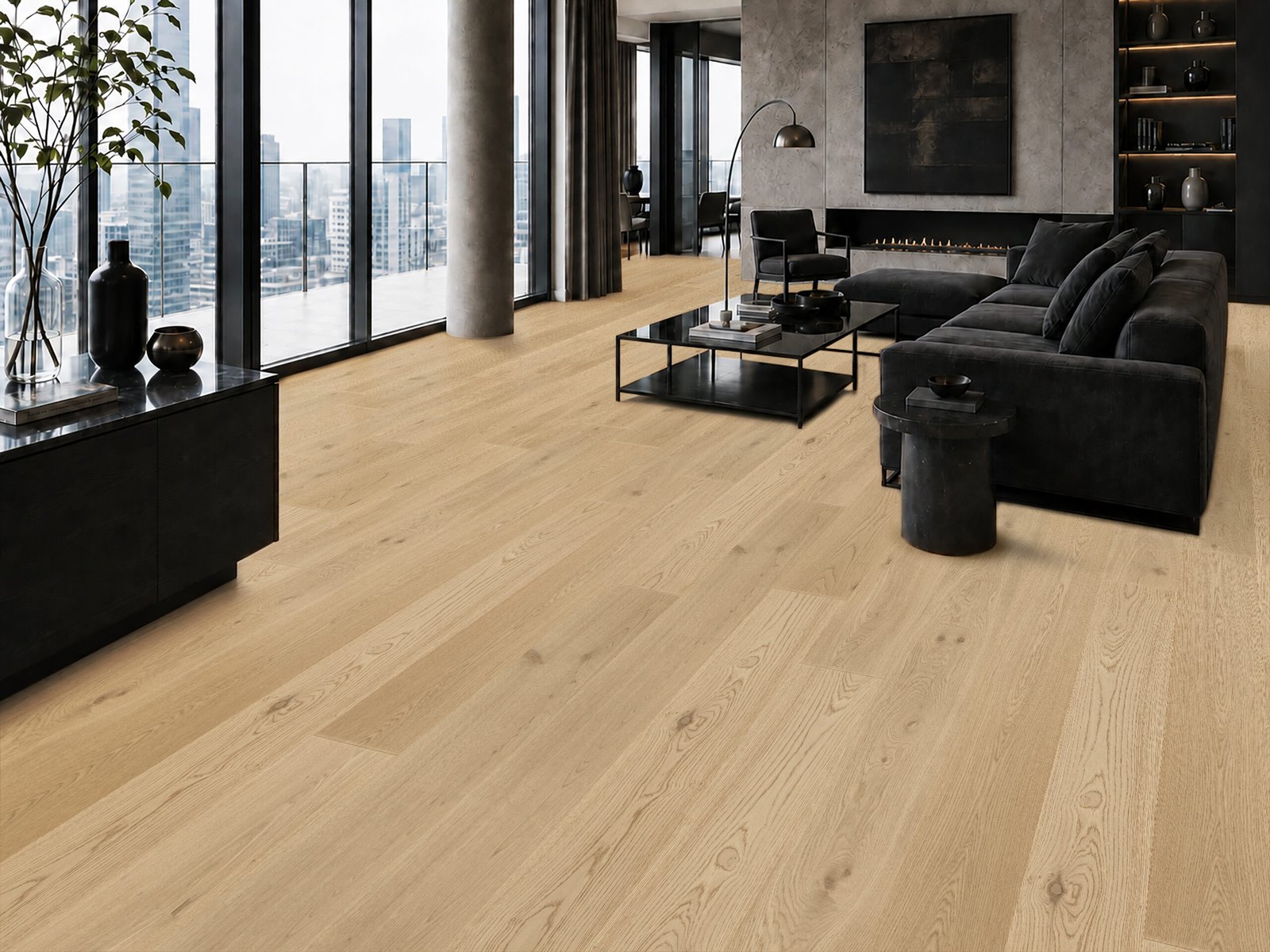
| Light tones | Laguna | Light natural oak with soft warmth and fine grain | Compare with Riviera for natural versus cream |
| Light tones | Riviera | Soft light cream with a clean, bright appearance | Compare with Laguna for the base color |
| Light tones | Carrara | Light gray-beige and off-white appearance, with visible knots | Compare with Riviera for tone and wood character |
| Balanced neutrals | Venice | Light beige with soft gray undertones and a gently weathered appearance | Compare with Toscana for beige-led versus balanced greige |
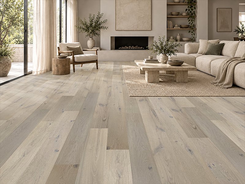
| Balanced neutrals | Toscana | A balanced blend of soft gray and beige, with clear grain | Compare with Venice for the neutral balance |
| Warm natural bridge | Cordoba | Warm natural oak with clear grain and gentle tonal variation | Place between the neutral and brown groups |
| Warm browns | Auburn | Earthy warm brown with prominent knots and rich grain | Compare with Savoy for earthy versus amber |
| Warm browns | Savoy | Rich amber brown with distinct grain and a classic warm appearance | Compare with Auburn for the brown direction |
Cordoba serves as a bridge rather than another gray-based neutral. Keep that distinction visible in the label.
2. Arrange Samples for Useful Side-by-Side Comparisons
A practical left-to-right sequence is Laguna, Riviera, Carrara, Venice, Toscana, Cordoba, Auburn, and Savoy. It moves through the three groups while keeping related comparisons close together.
If the display uses two rows, keep the groups intact: the three light selections on one row, with Venice, Toscana, Cordoba, Auburn, and Savoy arranged together on the other. Give each sample comparable visible space rather than enlarging one color in a way that could imply priority.
Use the same sample orientation and label format throughout. Where possible, review the samples under the same display lighting. The purpose is to make comparison easier, rather than to establish a fixed color appearance for every setting.
For a focused light-color discussion, the [Laguna light natural oak flooring product page] can provide the associated product details without crowding the display label.
3. Explain Undertone and Character with Specific Language
Color names alone do not explain a collection. Add one short sentence that tells the customer what to look for.
For Venice and Toscana, describe the balance: “light beige with soft gray undertones” versus “balanced gray and beige.” For Auburn and Savoy, describe the brown direction: “earthy warm brown” versus “rich amber brown.”
Keep appearance terms within their limits. “Weathered” describes Venice’s visual effect; it does not establish reclaimed wood or a particular treatment. “Washed” describes Carrara’s appearance without confirming bleaching or staining. Auburn’s rustic appearance does not change its Natural Grade or establish a smoking process.
Natural grain, knots, and tonal variation belong in the explanation. Use physical samples to confirm a selection, and avoid suggesting that one photograph represents every board. The [Toscana greige oak flooring product page] is a useful reference when a customer needs more detail about that neutral option.
4. Keep Shared Specifications Beside the Color Display
A color comparison should remain connected to the correct product specification. For these eight Amara selections, the shared format is 10.25″ wide × 86.6″ long, approximately 260 × 2200mm, with a 5/8″ total thickness and 4mm sawn-cut oak veneer.
The shared specification also includes European oak, plywood construction, Natural Grade, matte UV-cured urethane, light wire brushing, and micro-beveled edges. Installation is glue down or nail down.
Place these details on a shared specification card, while giving every sample its own color name. Include 36.942 sq.ft. per box and 73.41 lbs. per box so purchasing teams can connect the showroom selection to product records.
If warranty information is displayed, retain the complete wording: 50-year residential / 5-year light commercial warranty. Subject to warranty terms and conditions.
5. Turn the Display into a Purchasing Conversation
Once buyers have identified a group, ask which colors they want to evaluate together, which sales market they serve, and what quantity they are considering. This creates a useful brief for dealer samples and product information without treating display position as a stocking recommendation.
Keep related categories separate. If a customer also asks about coordinated flooring and stairs, review those products through their own specifications. The supplied red oak example pairs three-meter flooring with stair treads and stair risers for color and overall visual coordination; it is separate from Amara and does not establish matching Amara stair products.
Plan Your Amara Display with FineFloor
Share your company, sales market or project, preferred colors, specification requirements, and estimated quantity. Contact FineFloor to request dealer samples and product information, and discuss bulk purchasing or channel cooperation.
6. Frequently Asked Questions
Should the display follow a best-selling color order?
This plan groups colors by appearance and comparison value. It does not establish sales rankings, demand levels, or recommended inventory quantities.
Where should Cordoba sit?
Place Cordoba between the balanced neutrals and warm browns. Its warm natural oak appearance provides a useful transition while remaining distinct from the gray-beige selections.
Can one sample show the full appearance of a color?
A sample provides a reference, while natural grain, knots, and tonal variation remain part of the product. Review physical samples when confirming the selection.
What should distributors and large retailers include in an inquiry?
Provide the company, sales market or project, intended colors, specification needs, and estimated quantity. Ask for the relevant dealer sample information and product documents.