
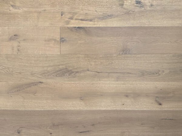
For buyers comparing grey oak flooring, the useful distinction is how gray and beige combine—not simply whether a product belongs in a “gray” category. Venice has a light beige appearance with soft gray undertones and a gently weathered look. Toscana blends soft gray and beige into a balanced neutral greige, with clear natural oak grain.
For U.S. distributors and large retailers, these colors can serve different display purposes within FineFloor’s Amara Collection. Present Venice through its soft beige-gray character and Toscana through its balanced greige appearance. Then use physical samples and coordinated materials to explain the difference.
1. Describe the Color Before Naming the Style
“Greige,” “beige-gray,” and “gray oak” can leave customers uncertain unless the display explains what those words mean. Begin with the product’s documented appearance, then connect it to a design direction.
| Comparison Point | Venice | Toscana |
|---|---|---|
| Color description | Light beige with soft gray undertones | A balanced blend of soft gray and beige |
| Overall appearance | Soft, gently weathered, and calm | Neutral, balanced, and contemporary |
| Wood detail | Natural oak grain | Clear natural oak grain |
| Suggested style direction | Coastal, transitional, and quiet residential interiors | Modern furniture, simple architectural lines, and urban interiors |
| Useful sample label | Light beige with gray undertones | Balanced neutral greige |
| Main point to explain | The beige appearance and soft gray undertone | The combination of gray and beige |
These are descriptions of the two products, not universal definitions of color names. Keep the same wording on sample labels, product summaries, and sales materials so customers receive a consistent explanation.
2. Give Venice and Toscana Distinct Roles
Consider Venice weathered beige European oak flooring when the intended selection calls for light beige with a soft gray undertone. Its gently weathered appearance supports coastal and transitional presentations, particularly when paired with relaxed fabrics and understated finishes.
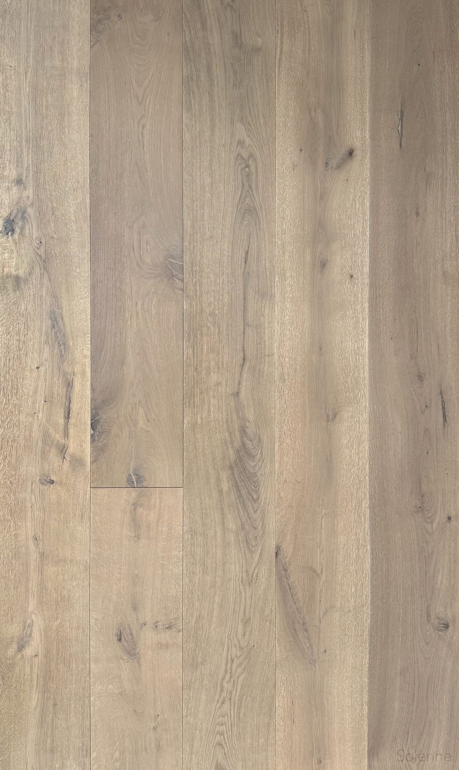
“Weathered” describes the look. It does not establish reclaimed material or a special distressing process. Sales teams should explain the visible appearance without adding an unconfirmed manufacturing story.
Consider Toscana greige European oak flooring when the assortment needs a balanced gray-beige option for contemporary displays. Its clear oak grain provides natural detail alongside modern furniture and simple architectural lines.
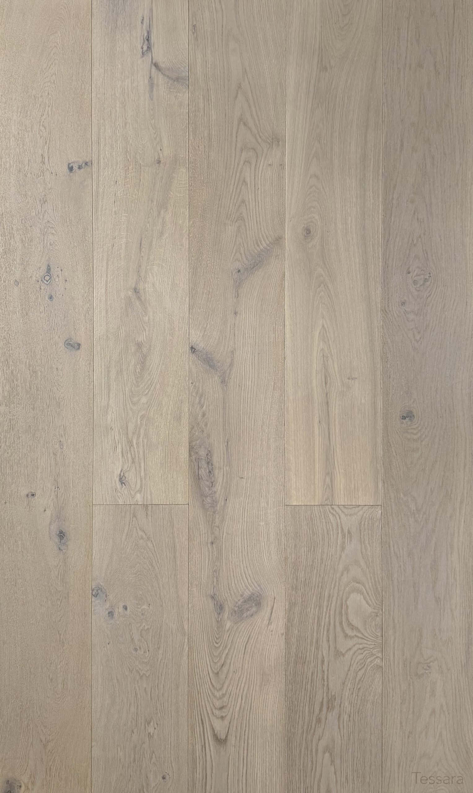
If both colors are included, give each a defined purpose. Venice can represent the soft weathered beige direction, while Toscana represents balanced greige. If selecting only one, compare the samples with the actual materials planned for the display. The available information does not establish which color will sell more.
3. Build a Display That Answers “Which Works Here?”
Use the same sample format for both colors. Comparable board sizes and a shared arrangement make the color comparison easier to follow.
For Venice, try off-white textiles, woven accents, and muted neutral finishes. This presentation can illustrate its soft beige-gray appearance without suggesting that coastal styling is its only use.
For Toscana, use clean furniture lines, restrained metal accents, and neutral upholstery. Keep the composition simple enough for the oak grain to remain visible.
A useful staff explanation is: “Venice offers light beige with soft gray undertones and a weathered appearance. Toscana combines gray and beige in a balanced greige.” Follow that explanation with the samples rather than additional color adjectives.
Review both beside the proposed cabinetry, wall finish, and upholstery. Show several boards where possible to represent natural color and grain variation. Room imagery explains a pairing; the physical sample remains the reference for color selection.
4. Keep Shared Specifications Beside the Color Comparison
Venice and Toscana share the Amara Collection’s documented format. Buyers can therefore assess their visual differences while keeping the listed construction and packaging references consistent.
Both are European oak engineered hardwood flooring with 10.25″ × 86.6″ planks, approximately 260 × 2200 mm. Total thickness is 5/8″, including a 4 mm sawn-cut oak veneer over plywood construction.
Both are Natural Grade, with light wire brushing, matte UV-cured urethane, and micro-beveled edges. Installation is glue down or nail down. Describe these features separately from the color: “weathered” and “greige” do not identify different construction systems.
Each carton contains 36.942 sq. ft. and weighs 73.41 lbs. Record both figures when preparing purchasing requirements.
The stated warranty is 50-year residential / 5-year light commercial. Subject to warranty terms and conditions. Retain that qualification wherever the warranty appears.
5. Turn Sample Selection into a Clear Purchasing Brief
Once the display direction is chosen, record the color name, sample reference, specifications, and estimated quantity together. Include the sales market or project context so the inquiry explains how the product will be presented.
For projects involving stairs, review adjacent stair materials independently. A separate AB Grade red oak program combines 3-meter engineered flooring with coordinated engineered stair treads and stair risers. Color coordination concerns the overall visual relationship; it does not mean identical face thickness or construction.
That red oak combination is separate from Venice and Toscana. Review red oak flooring and coordinated stair products [同站配套产品链接待填;发布前确认FineFloor供应范围及对应页面] only where relevant, and confirm any proposed pairing through project drawings and approved samples.
For Amara purchasing discussions, ask FineFloor about dealer samples, product documents, and supply availability. Submit your requirements rather than assuming unconfirmed commercial conditions.
Frequently Asked Questions
Is Venice the same color as Toscana?
No. Venice is described as light beige with soft gray undertones and a gently weathered appearance. Toscana combines soft gray and beige into a balanced neutral greige.
Does “weathered” mean Venice is reclaimed or specially distressed?
No. It describes Venice’s appearance. The confirmed surface specification is light wire brushing with matte UV-cured urethane; a special distressing process is not specified.
Do the two colors have different dimensions or carton coverage?
Their documented dimensions and packaging figures are the same: 10.25″ × 86.6″ planks, 36.942 sq. ft. per carton, and 73.41 lbs. per carton. Both have a total thickness of 5/8″.
What should distributors and large retailers provide when requesting samples?
Include your company name, sales market or project, intended colors, specification requirements, and estimated quantity. Ask FineFloor to confirm sample arrangements, product information, and supply availability.
Discuss Your Neutral Oak Assortment
Contact FineFloor to compare Venice and Toscana, request dealer samples and product documents, and discuss bulk purchasing or channel cooperation.